09
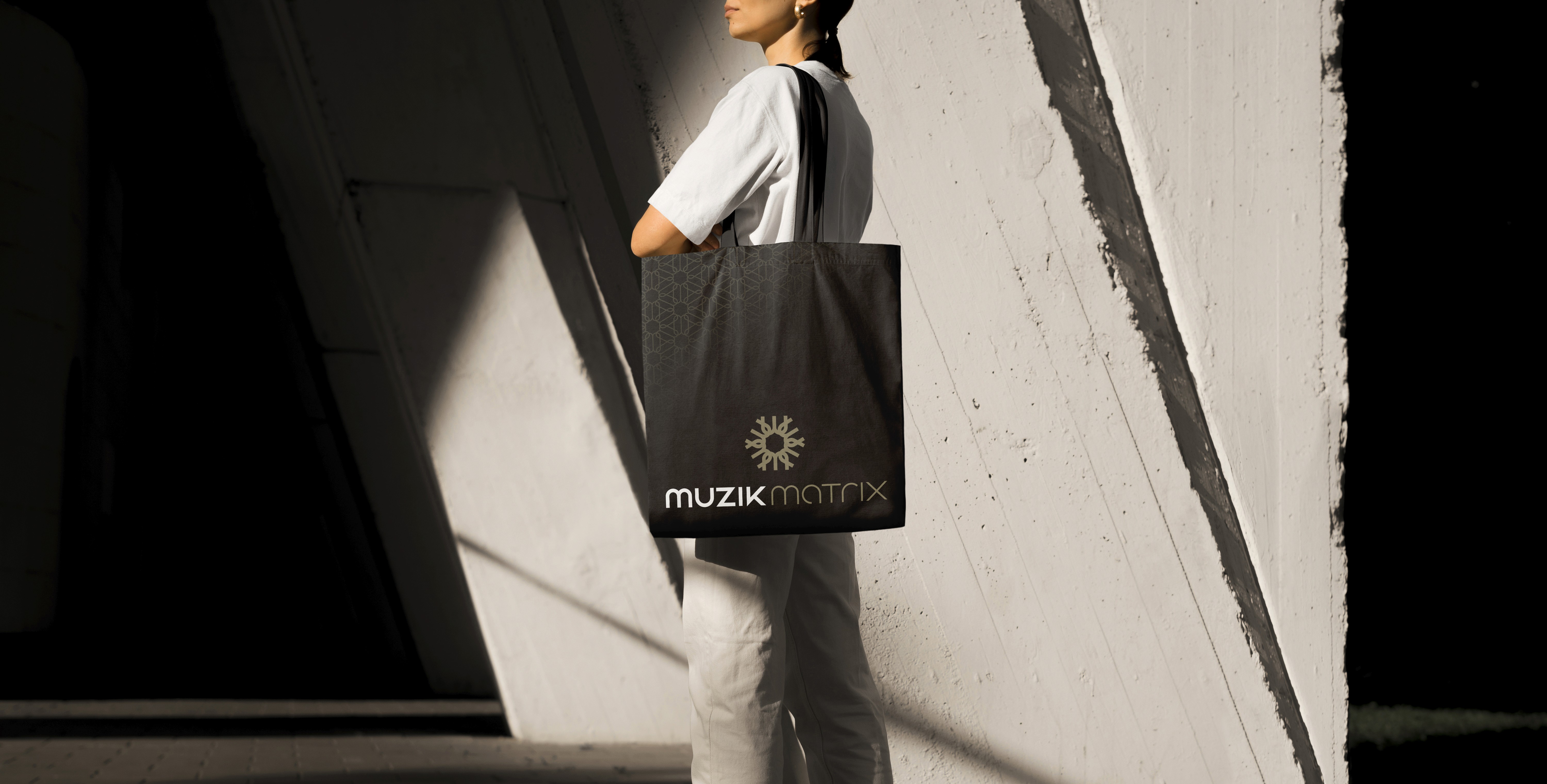
Muzik Matrix
Client
Client
Muzik Matrix
Muzik Matrix
Project
Project
Brand Identity
Brand Identity
Brand Identity
,
,
Art Direction
Art Direction
CASE STUDY
CASE STUDY
09
09
About
About
Muzik Matrix was created as a dynamic, purpose-built online platform where musicians of all levels could meet, learn, and grow together. It combined live remote instruction, expert insight, curated content, and advanced practice tools providing a unified experience. In parallel, the visual identity drew inspiration from a classical Piazza, a public square designed for gathering, exchange, and collective life. The logo’s custom typeface references Roman arch details, while the symbol abstracts the structure of a Piazza with a central open space, resulting in a mark that represents an interconnected community.
Muzik Matrix was created as a dynamic, purpose-built online platform where musicians of all levels could meet, learn, and grow together. It combined live remote instruction, expert insight, curated content, and advanced practice tools providing a unified experience. In parallel, the visual identity drew inspiration from a classical Piazza, a public square designed for gathering, exchange, and collective life. The logo’s custom typeface references Roman arch details, while the symbol abstracts the structure of a Piazza with a central open space, resulting in a mark that represents an interconnected community.


Quote
“Our strategy was to frame Muzik Matrix as a digital Piazza, a place of exchange, belonging, and growth. Building on this principle, a proprietary pattern was developed from the geometry of the brand mark. Conceived as a second identifier and a recognizable signature, the pattern embodies the brand’s DNA and extends the identity beyond the logo. It creates cohesion and value across all applications while delivering meaningful storytelling.”
Ivan Novotny, AOCAD | RGD